Favorite Android Apps of 2012
Eighteen months ago, I wrote an article about my Favorite Android Apps, but a lot has changed with Android and its app ecosystem since then. Developers have started putting more focus on design and usability when creating apps, and of course newer apps have come along that I have come to rely upon. I myself have upgraded to newer devices, with a Nexus 7 replacing my Galaxy Tab 10.1, and a Galaxy Nexus from work has sadly replaced my beloved but aging Nexus S. So what follows are some of my favorite new apps from 2012, and some follow-up on what my previous favorite apps look like in modern attire. All screenshots are taken from devices running Android 4.2.1 (CM 10.1 nightlies).
-
Press - $2
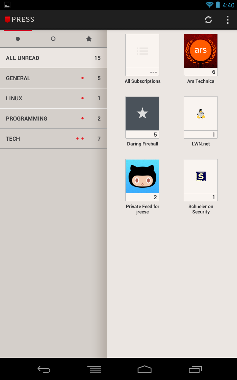
While I used to use Shaun Inman’s excellent newsreader Fever, during my efforts to purge my server of all things PHP, it had to go. I exported my feeds to Google Reader, and have been quite happy with their solid web interface. The Android experience, on the other hand, is spartan and dated. There are numerous third party clients that try to improve upon the Reader experience, but most have problems of their own, either in looks, features, or user interaction. That’s where Press shines.
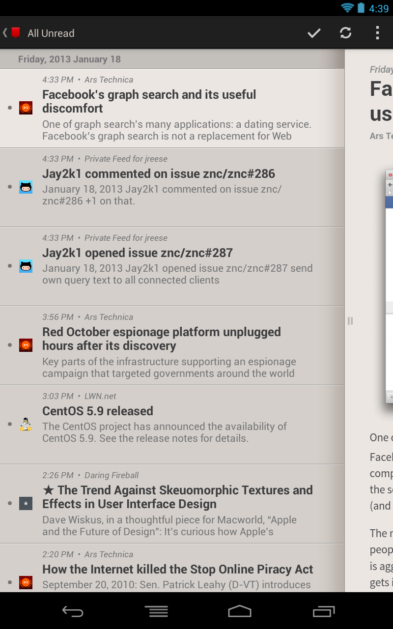
Sneaking into 2012 near the end of December, Press boasts first class app design, with a good reading flow that’s gotten even better with the recent 1.1 update. Press features three primary views that you swipe between: a list of your various feeds if you prefer to read everything or just an individual news feed, a list of articles, and the article itself; swiping left and right moves between these views, and subtle buttons at the bottom of the article view allow you to jump between articles.
With a combination of stunning UI and great interaction, this app is a total steal for anyone who frequently gets their news from RSS feeds.
A feed reader that looks this beautiful should cost more than this.
-
Instapaper - $3
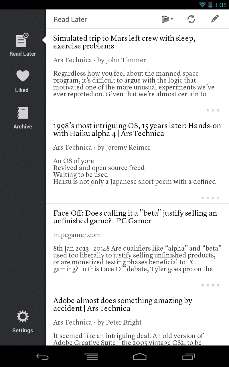
In the last review, my favorite “save for later” app was Read It Later, which has since been rebranded as Pocket, though I commented at the time that I had wished that Instapaper could have been a contender. Since then, Instapaper officially released an Android client, and I jumped at the chance to try it out. It’s an excellent app, and I think it’s both simpler and cleaner than the competition; a good match for their web interface, and my favorite way to read long articles. My only complaint is that I’m not fond of the font choice for the article list.
Instapaper looks its best in the reading-friendly tablet UI.
-
Reddit Is Fun - Free with $2 premium features
One of my favorite time wasters, when I don’t feel like reading, is browsing the wonderfully terrible r/pics and r/aww. While Reddit’s mobile website is decidely subpar, Reddit Is Fun has brought the time wasting to Android in a simple, well-designed package. It has plenty of options for customizing the look and behavior of the app, what subreddits are shown by default, and more. I’m unconvinced by the premium features, but I was more than happy to support the developers of such a solid app.
Simple, swipable interface that allows instant gratification.
-
Pocket Casts - $3
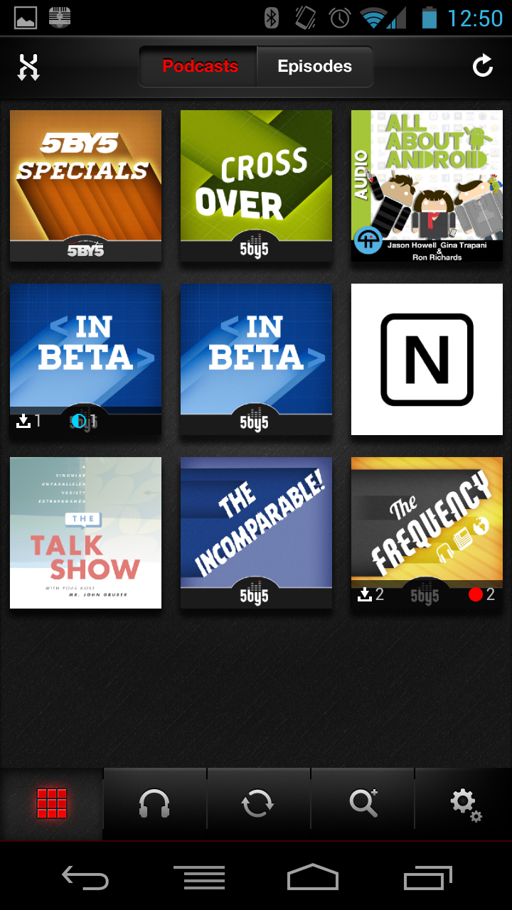
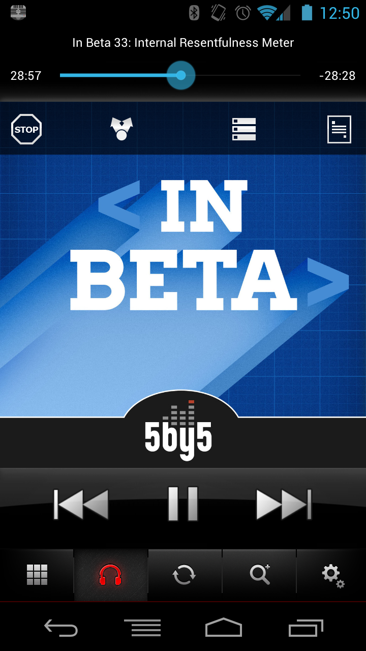
In the past, my favorite podcast app was DoggCatcher, an excellent entry that I used for many years. Recently though, I found Pocket Casts, and while it’s not as nice looking as DoggCatcher — it suffers from iOS syndrome IMO — it does have one killer feature that the alternatives do not: a playlist. Pocket Casts can automatically add newly downloaded episodes into your playlist, which allows you to listen to your podcasts in a more “natural” order — the order they were released. This alone has converted me to using Pocket Casts full time, although I would be hard-pressed to find a reason to stick with it if DoggCatcher were to implement that one feature. My biggest gripe with Pocket Casts is that the play/pause/seek buttons are only visible and active from the “now listening” tab, which is especially obnoxious when the app doesn’t always default to opening that view when launched. This is something DoggCatcher got right from day one, and it’s surprising to me that an app centered around listening to audio wouldn’t have those controls available at all times.
A simple interface with features designed for dedicated listeners.
-
Falcon Pro - $1
Plume has long been my preferred Twitter client on Android, but I was looking at alternate clients, and my favorite so far is Falcon Pro. It has fewer features overall than Plume, but the user experience is simpler and seems more useful to how I use Twitter as a passive source of information and links. Falcon’s best feature is its inline web viewer, which allows me to see linked articles quickly without waiting to switch over to my primary browser, while still leaving that option available to me if I need it. Typography and design are overall nicer than Plume, and it has one of the best light-on-dark themes that I’ve seen on Android. The biggest feature I miss from Plume is support for the new enhanced notifications on Jelly Bean; Plume could show me the latest tweet in detail, where Falcon Pro only shows me an unread count.
Elegant looks with a great user experience.
-
Locale - $5
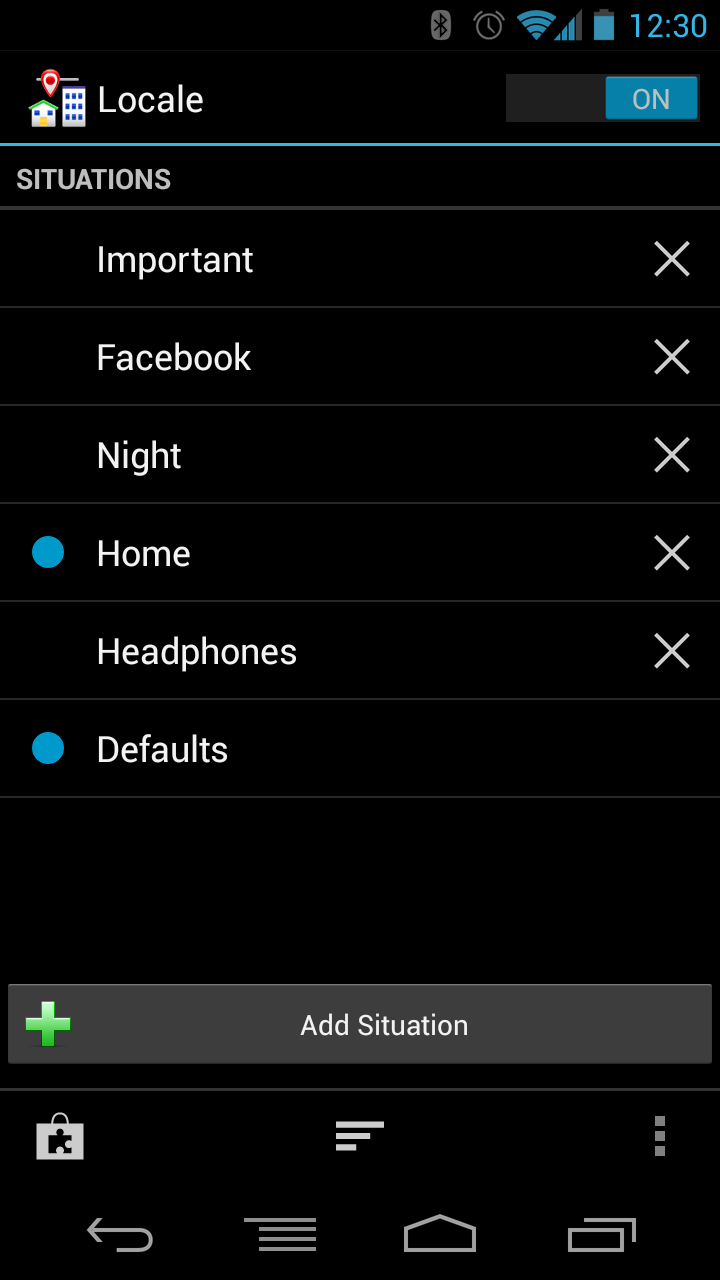
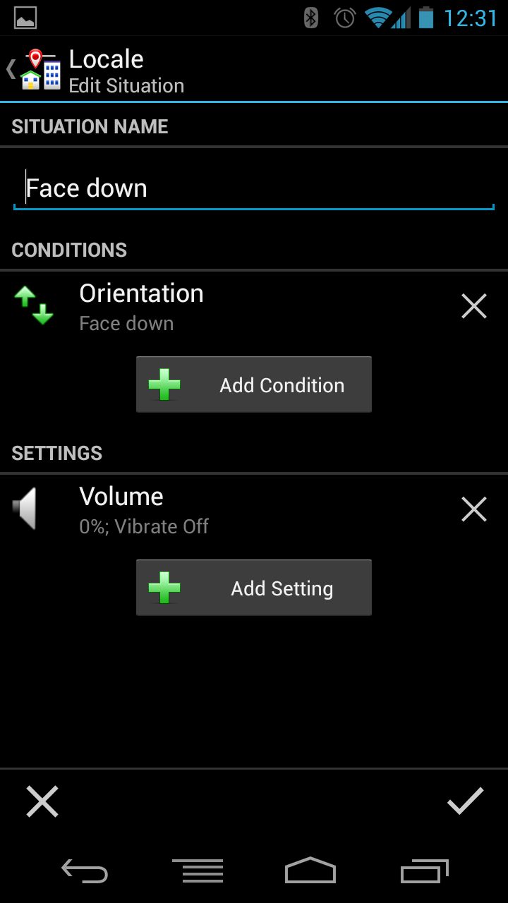
I’ve probably talked more about Locale than any other app for Android, but it’s always worth repeating, and it just keeps getting better and better. Having a phone that’s smart enough to adapt to my daily routine is liberating. I never need to worry about setting my phone to silent when I get to work, I’m never bothered when I’m trying to sleep, and I never miss a call because I forgot to turn my ringer back on; Locale just takes care of all that for me. It’s so much easier to use than all of its competitors, and it’s worth every penny.
Tapping a situation allows you to modify the conditions that trigger the situation.
-
Spotify - Free with paid subscription
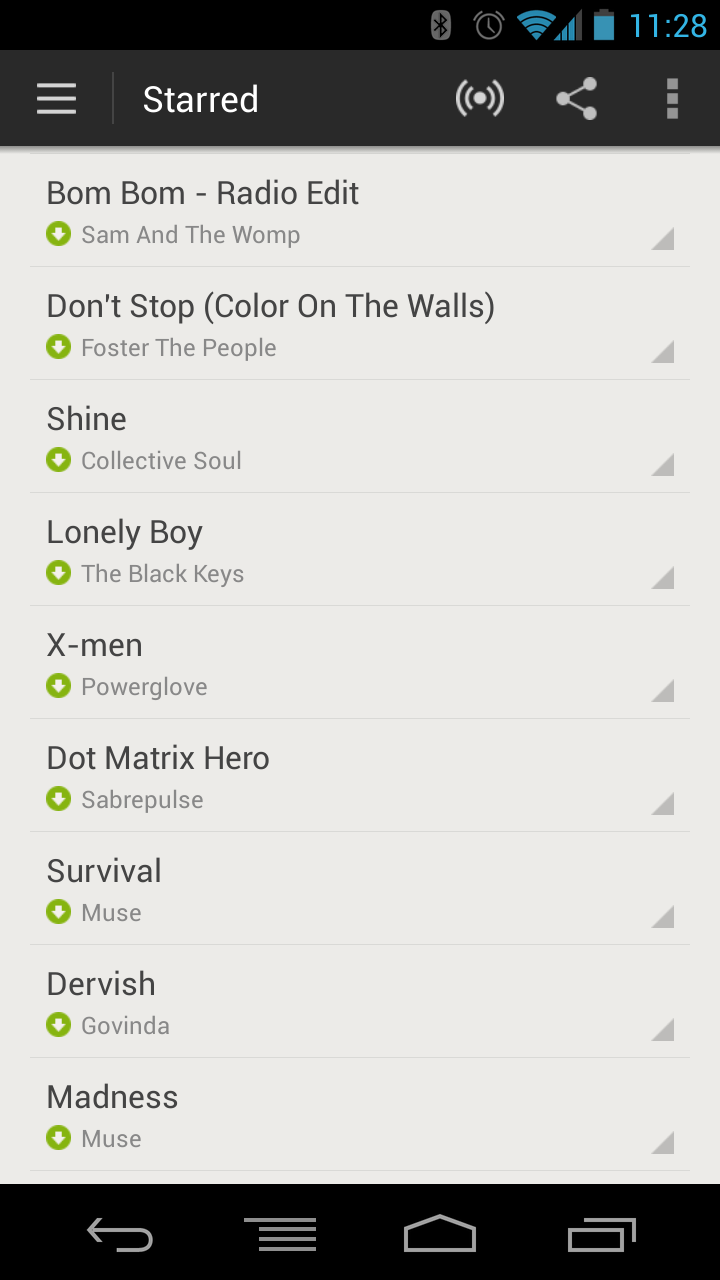
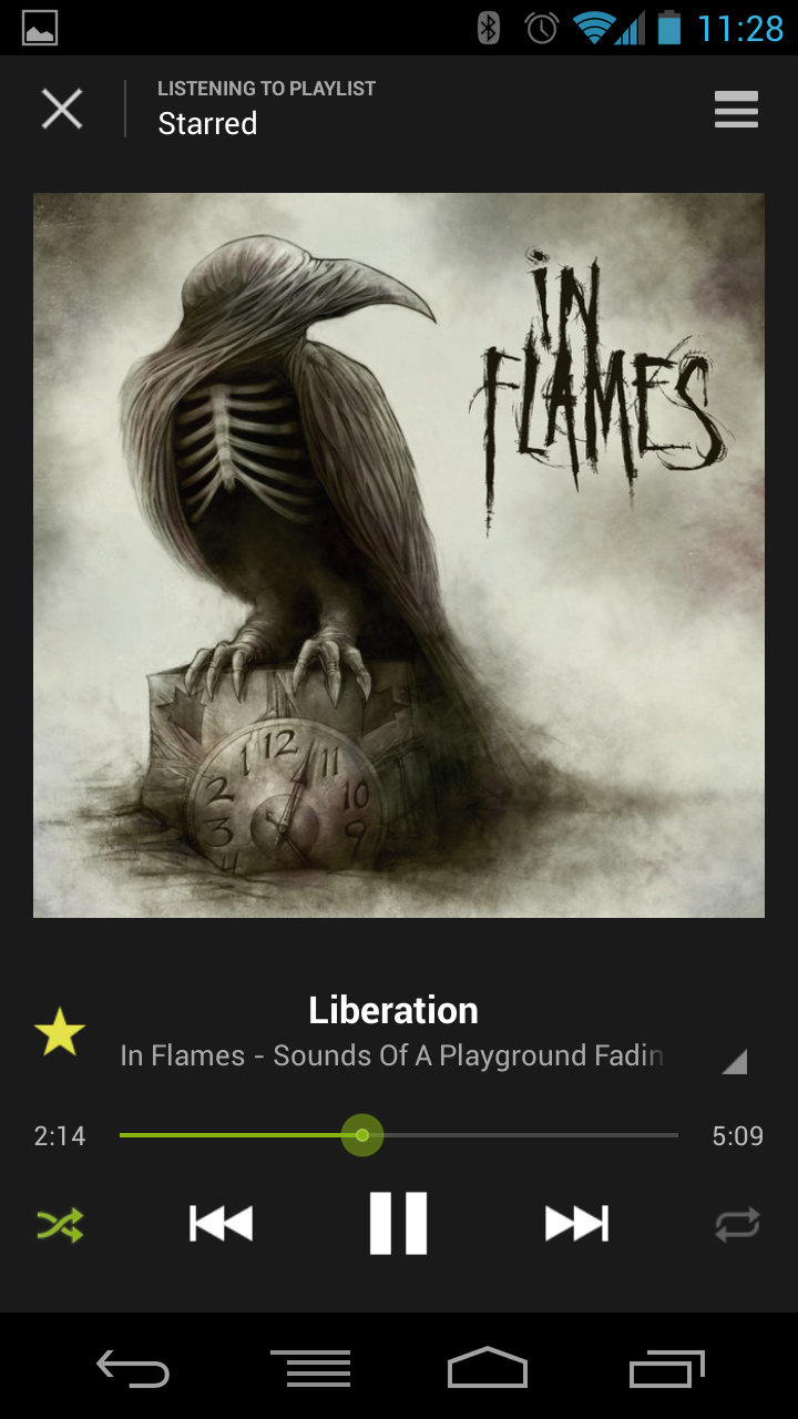
Where Pandora was my music app of choice for the last review, Spotify has stolen my loyalty by combining on-demand music from an extremely large library with trainable radio stations that rival even Pandora’s excellent algorithms. The desktop application actually works really well, and the first-class integration with local mp3 files coupled with the ability to sync playlists between the desktop and mobile apps leaves me with no other credible choice. This is truly the best way to listen to music in the modern age.
The best library of on-demand music, and a great looking app to go with it.
-
Dropbox - Free
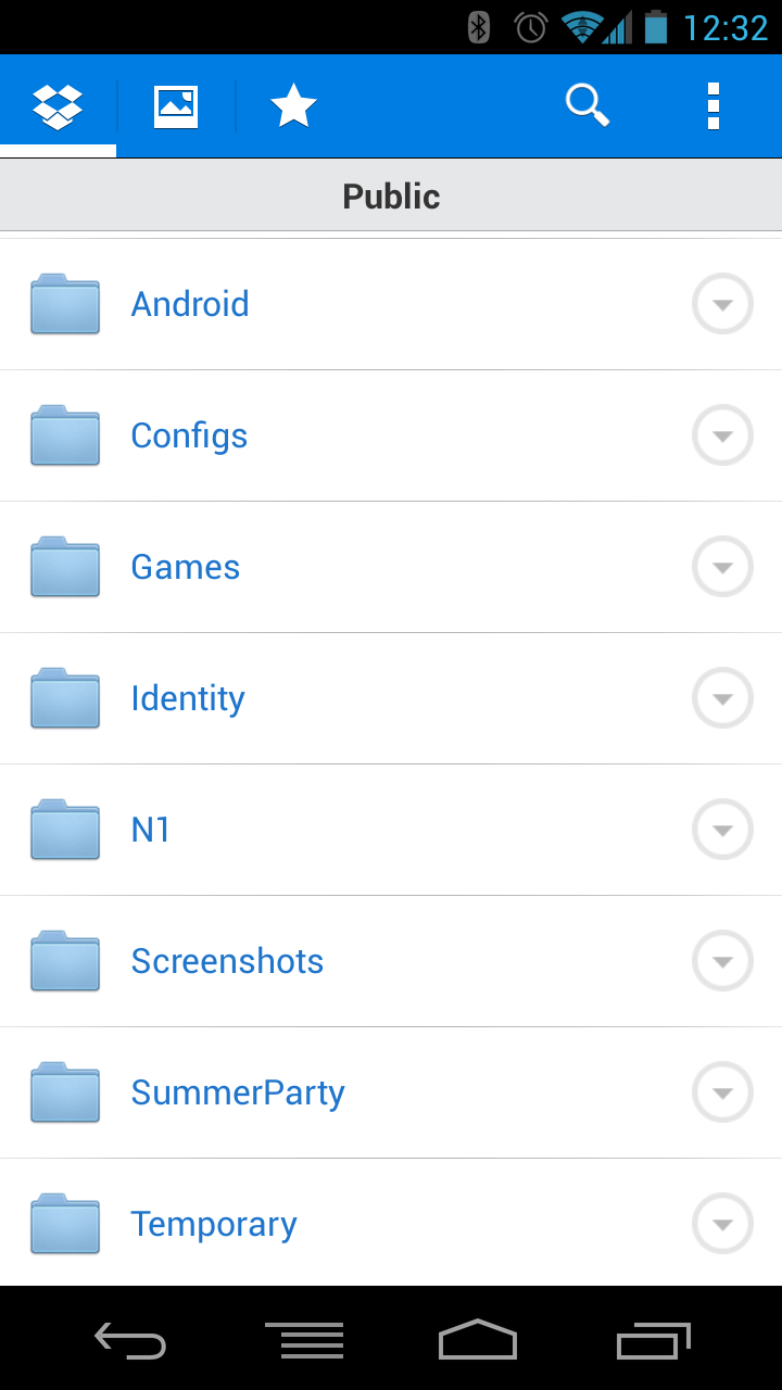
Since the last review, Dropbox has added automatic uploading of photos to your account, as well as drastically improved the look and experience of their Android app. The ubiquity of Dropbox clients is still it’s biggest selling point, and the reason why I gladly pay for a larger storage quota.
Everything you could want or expect from a file syncing service.
